
Information Architecture Rebuilt From Scratch
We reorganised the site around how buyers evaluate software, merging related pages into scroll-through views with in-page anchor links.
Find It Easy is a Canada-based software company that has built business intelligence and change impact analysis tools for over 33 years. Its patented technology runs at organizations like Mayo Clinic, John Deere, and Bloomberg BNA, backed by a 96% customer renewal rate.
Find It Easy’s website had grown messy over the years. Buyers had to click through too many menus and pages just to understand the product. We simplified the navigation, put pricing, editions, and specs on one page, and made the free trial the one clear next step. We also moved client logos and proof closer to where buyers decide.
Find It Easy’s website had grown around the company’s own structure, not the buyer’s journey. A UX audit found four problems, each adding to drop-off during evaluation.
The seven-item menu went four or more levels deep and followed internal categories, so buyers struggled to find related information.
Pricing, editions, specs, and FAQs lived on separate pages, so buyers kept jumping back and forth to compare options.
Heavy data tables, stock photos, and inconsistent typography looked dated and undercut the credibility the client list should have built.
Free trial, New quote, Shop, and Request a demo carried equal weight, so visitors had no clear path to download.
The redesign ran as six connected workstreams. Each tackled a specific problem on the old site, and together they gave buyers one clear path to the free trial.
We reorganised the site around how buyers evaluate software, merging related pages into scroll-through views with in-page anchor links.
Download Free Trial became the single goal at every key decision point, and demo and quote requests now support it.
Editions, pricing, specs, and comparison data now sit together, so buyers can finish evaluating without leaving the page.
A defined type hierarchy, consistent spacing, a restrained palette with one accent colour, and product visuals replaced the dated look.
Client logos, savings data, testimonials, and trust stats moved out of the Customers section and into the buyer’s path.
Solutions pages were rewritten as unified, scannable narratives, and technical content was simplified so non-technical evaluators could follow it.
The product stayed the same. What changed was how the website presented it. Here’s the site before the redesign, and what buyers find now.
Nested mega-menus ran four or more levels deep. Overlapping categories left buyers unsure where to click next.
A flat structure with clear main sections. Anchor-based scrolling replaced jumping from page to page.
Pricing, editions, and specs lived on different pages. Buyers kept going back and forth to piece the picture together.
All product information now sits on one page. Editions, pricing, and specifications read as a single scroll-through experience.
Free trial, shop, quote, and demo all asked for attention at once. New visitors had no clear first step.
One clear primary action, Download Free Trial, is reinforced at every stage of the visitor journey.
A strong client list and a 96% renewal rate sat under a Customers dropdown. Most visitors never got that far.
Client logos sit above the fold, savings data appears on product pages, and testimonials stand beside the key conversion points.
Dated design and generic stock images made a 33-year-old enterprise software brand look less credible than it was.
Clean typography, product screenshots, and a restrained palette now signal the enterprise credibility the software has earned.
The numbers below belong to Find It Easy’s software. The redesign’s job was to make sure buyers saw them.
Prime Builder is a growing manufacturing business in India, with operations spread across multiple sites. Raw materials arrive from vendors,…
Study School is a well-established Jaipur school with three branches and hundreds of students, from Nursery through Class 12, in…
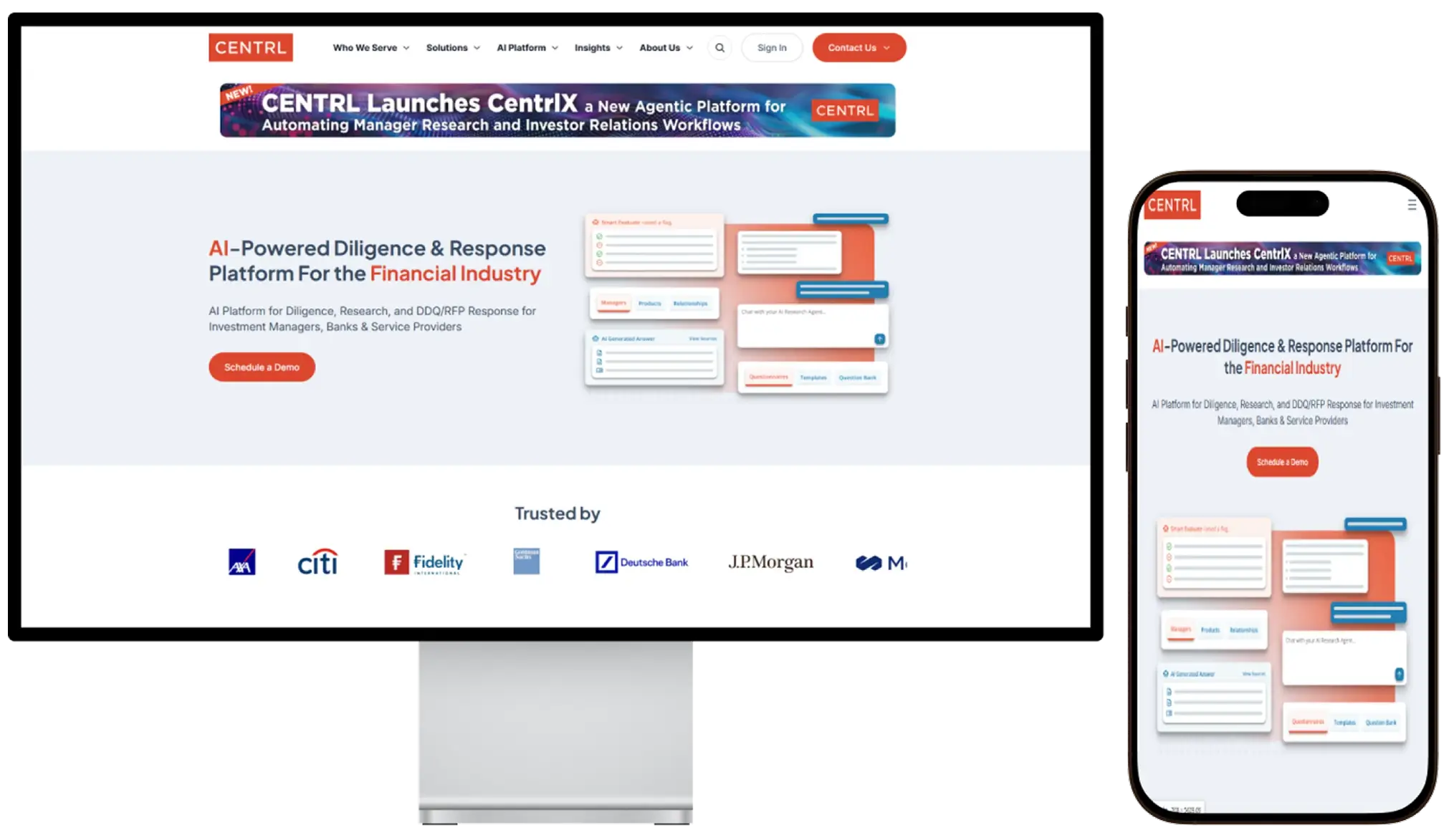 Centrl.ai
An AI-powered financial platform that automates analysis and risk workflows for faster, smarter decisions.
Running a SaaS product, an enterprise software business, or a B2B brand? We’ll build your site around how your buyers evaluate, not around your internal org chart.
Tell us what you're building and we'll show you how we'd approach it — with the work to back it up.